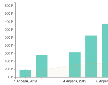
The average amount of expenses in the form of graphs
Hooray! The long-awaited schedule has appeared. The beauty of it is that you can see a lot of information on your expense for a certain time. So far, there are three timelines available:
- Current month
- 3 months
- Year
Now you visually see your expenses by day. In the graph of "average expenses", the columns indicate the total amount of expenses on a specified day. And the smooth line that runs through all the columns is the average cost per day on a specified day. This value is very easy to find. You need to divide the entire amount of expenses on this day by the number of purchases on that day. Everything is very simple.
Why do you need this information? Elementary, Watson, dear visitor. It became clear to me how much on average you need to take money, so that I have enough for what you need to buy. From the bottom of the infographic there is general information, where the average amount for the selected period is indicated. My amount is 364 rubles a day.
This is how the total of your budget looks.
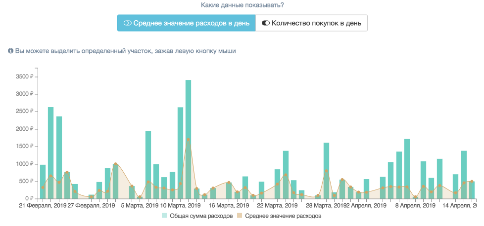
Picture 1. Graph of average costs
At the very bottom there is a link that will show the full information for each month that fell in the selected period. No matter how I try to spend differently, but the average value is always about the same number! Here is the number of purchases I have is clearly different.
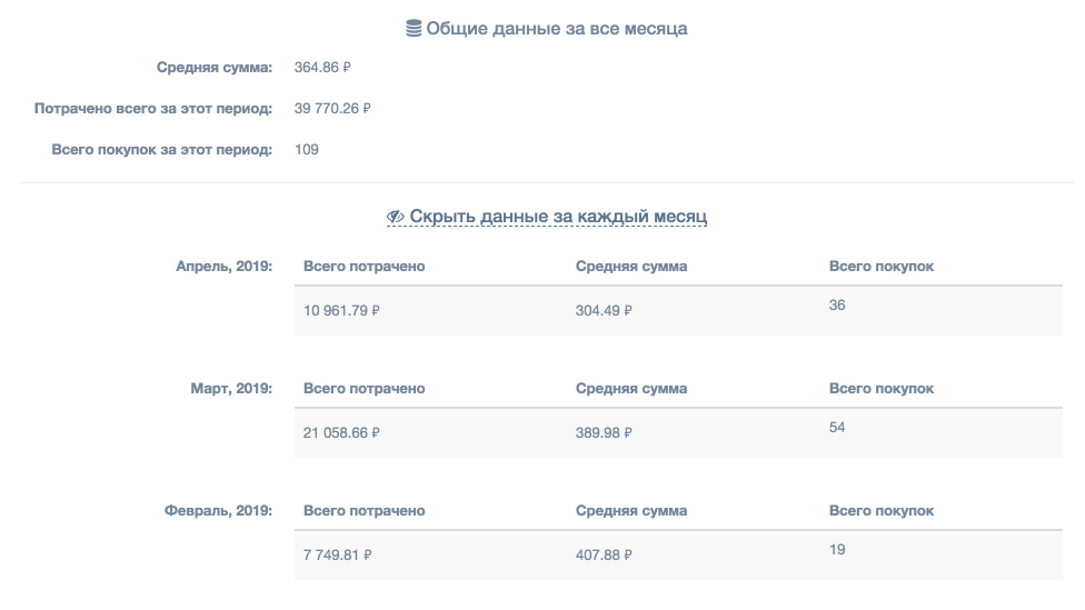
Picture 2. General information by month
If you switch the display to "number of purchases per day", then only the columns with the total number of purchases for the specified day will be displayed on the graph. Thanks to this knowledge, I learned that on average I buy in two stores a day. This information can help in the future. For example, I specifically can take less money to go to only one store for a specific product. In this case, you can save a lot of money.
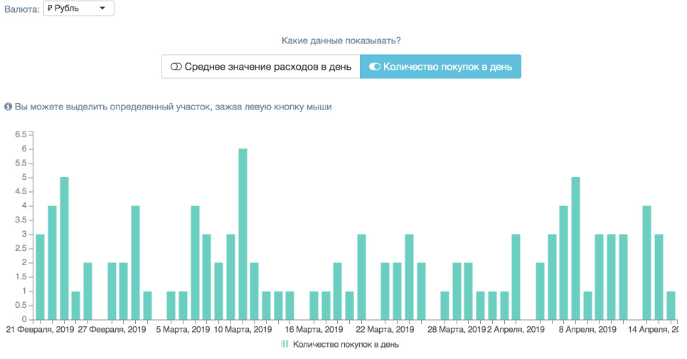
Picture 3. The graph of the number of purchases
This schedule gives the same opportunity as the "Daily expenses" schedule, namely clicking on the column to open full details of expenses for the selected day. It looks like this:
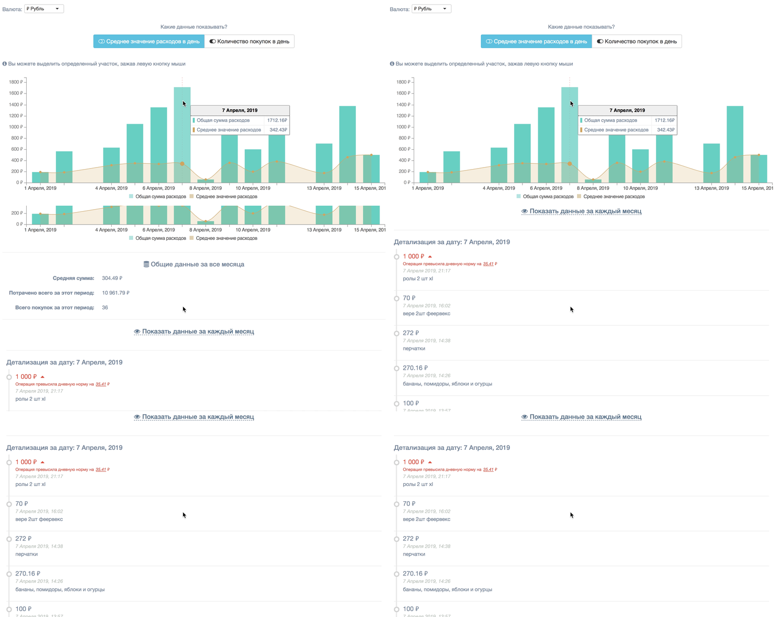
Picture 4. Detailing costs by clicking on a column.
If there are too many columns on the graph, then you can always select the period you need and look at it closely.
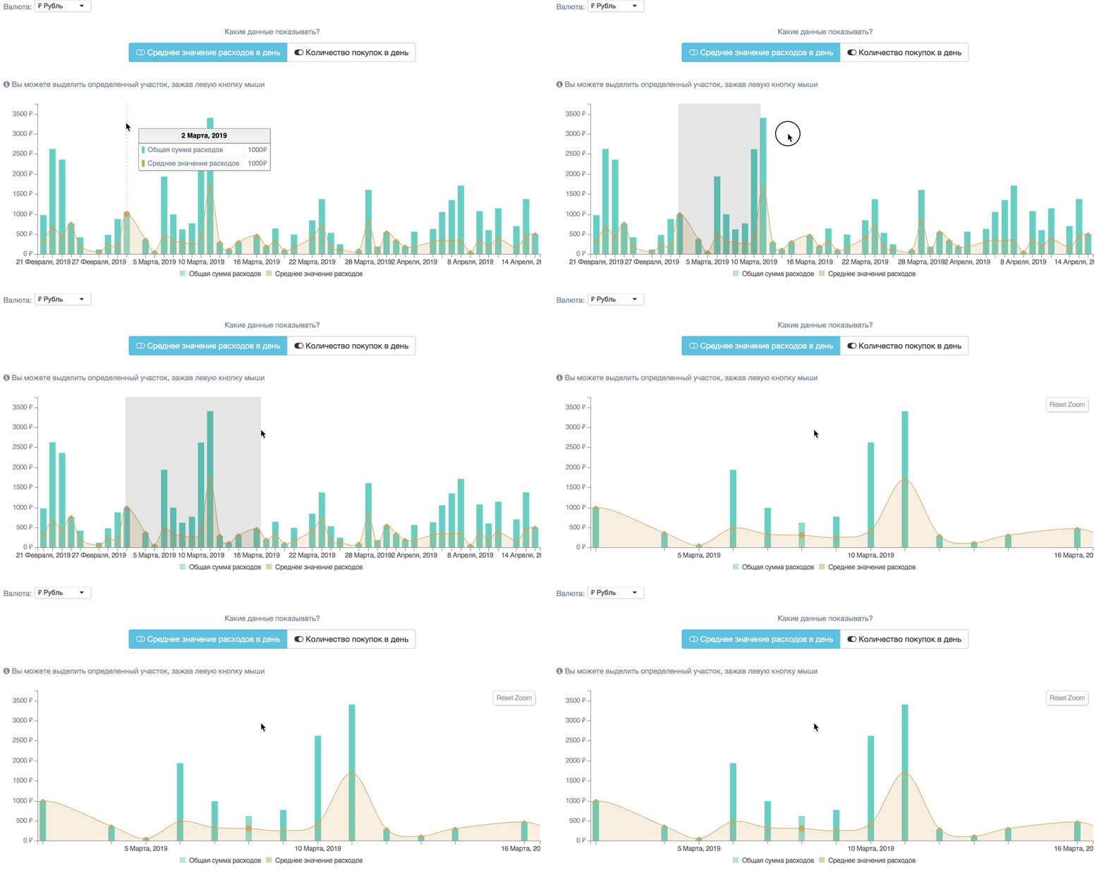
Picture 5. Selection area
I hope this information is useful to you and you will actively use it. Thank you for your attention and see you soon! If you like my site, be sure to register!
